

If you’ve always been curious whether you’re living in a male-dominated, or female-dominated area, then this latest map is for you.
Someone Made an Interactive Map to Check Many % of Where You Live is Male or Female & Their Age
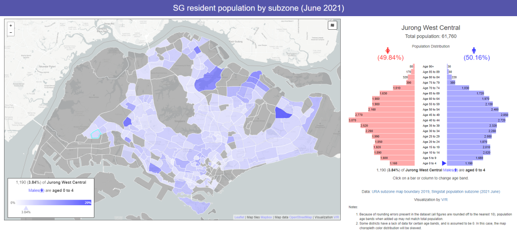
On 13 Nov 2021, Reddit user u/Mezzohart took to Reddit to share his latest creation: an interactive map showing the percentage of males and females living in an area.
As for whether it’s accurate or not, the data is taken from Singstat and the author has double-checked the figures as well.
So if there are any errors in the data provided, it’s likely from Singstat, he added.
Population Trends Trivia
One weird trend that stood out was the male to female population in some areas.
This includes the National University of Singapore (NUS) where there are 64% females (62.5% aged 20 to 24 years old) compared to 36% males.
Overall, however, the population shows a pretty balanced ratio between females and males.
Other Trivia
In fact, the map isn’t just restricted to an overview of males vs females; click on any of the population pyramid bars and the colours on the map will change.

The darker the hue, the higher the number of people in that area.
We’ve gone ahead to play around with the map and here’s what we found out:
- Tampines North has the highest proportion of males and females aged 0 to 4 years old
- Coincidentally, Tampines North also has the highest proportion of males and females aged 30 to 34 years old, typically the age to start young families.
- Kampong Glam has the highest proportion of males in the age 90+ range, while Loyang West has the highest proportion of females aged 90+
- Meanwhile, mature areas such as Pearl’s Hill and Queensway has a higher proportion of older folks aged 65 to 69.
You can check out the map in full here.
Netizens’ Reactions
Of course, as with any forums, half the fun of checking something new out is looking at the users’ comments.
Here are a few noteworthy ones.
One asked for an “overall gender split” feature to be added:

Another thought that the data for Tekong seems iffy:

Another noticed that Kampong Glam has 100% males:

You’d also be interested to know that all the subzones with the highest number of young people are areas with many BTO projects:

As you can probably tell from the comments, the map, while published, is still being tweaked by the author.
You can check out the Reddit thread here.
Read Also:
- Gov.sg Releases a Heartwarming Song About COVID-19 Fight But People Are Hating On It
- Ho Ching Compares SARS with Delta Variant, Says SARS is Kindergarten Class & Delta is PSLE
- Woman Successfully Sued Mall Management for Damages After She Fell on Its Escalator
Feature Image: Viz.pop.sg
Here’s the REAL reason why everyone is hanging plushies on their bags, simplified for you: