When it comes to food, taste is not the only deciding factor. Its presentation is equally essential as well.
That’s why you’ll be glad to know that McDonald’s is redesigning their packaging into a sleeker and sexier design! Talk about dining with a view.
The view being your TV screen because 24-hour McDonald’s and McDelivery is back!
The fast-food giant has partnered with Pearlfisher to roll out these new packaging designs worldwide over the next 24 months, according to Mothership.
They have already been launched in Australia, New Zealand and the Pacific Islands, so hopefully, they’ll reach Singapore soon!
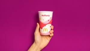
Pearlfisher has stated that they were looking to bring joy and ease to the brand, centering on McDonald’s “playful point-of-view”.
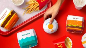
“From the cool blue waves on the Filet-O-Fish® clamshell to the golden, melting cheese on the Quarter Pounder® with Cheese, the packaging makes for an expressive, visual system. Each wrapper, clamshell and pack is identifiable, joyful and simple.”

As reported by Dezeen, Pearlfisher’s executive creative director Hamish Campbell noted that they “ strategically looked for the most direct way to communicate a playful and immediate expression of the product.”

That meant that some designs, like the box for the Big Mac and the Quarter Pounder, was a literal interpretation of the item.
Other designs drew inspiration from the most significant ingredient—the oozing cheese for the Cheeseburger, the beachy waves for the Fillet O Fish and a simple, round yolk for the Egg McMuffin.
Take a peek at the new looks of all-time favourites from the menu!


Pearlfisher has definitely fulfilled its promise of making the designs iconic and easily recognisable.
Feeling peckish now? Check out the Prosperity Burger and festive deals or click here if you like Pikachu and McDonald’s!
Feature Image: Pearlfisher


